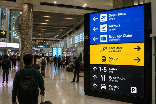
Airports, train stations, and transit terminals ask more from displays than a typical commercial space. Screens must be visible in motion, readable under mixed lighting, and dependable during long operating hours. For wayfinding, LED video wall panels should support calm decision-making, not add visual noise.
Transportation signage lives in a stressful environment. People are carrying luggage, watching schedules, managing children, or trying to find a gate, platform, exit, or connection. A display that is bright and colorful but hard to read does not help.
Pixel pitch, the distance between neighboring LED pixels, should be selected around real viewing distance. A large wall above a concourse can use a different pitch from a display near a ticketing line or boarding area. Content should use clear hierarchy, large type, and consistent symbols. Wayfinding screens should avoid unnecessary animation when travelers need fast information.
OAAA has long treated out-of-home media as a location-based communication channel, and transit environments are among the clearest examples of that idea. The message only works when it fits the place and the audience. For transportation teams comparing a transportation LED display solution, readability should lead the technical conversation.
Language planning matters as well. International airports, border stations, and tourist-heavy terminals may need multilingual content, recognizable pictograms, and consistent placement across repeated decision points. The display hardware is only useful if the information system behind it is easy to understand under pressure.
Transit hubs often combine daylight, artificial lighting, reflective floors, glass, and long sightlines. Brightness in nits describes display light output, but more brightness is not always better. The screen must stay readable without creating glare or discomfort. A station display may need different brightness behavior throughout the day as sun angles and passenger density change.
Viewing angle matters because travelers approach from many directions. A wayfinding wall should remain legible from the side, not only from directly in front. This is especially important in wide concourses and bus terminals, where people read while walking.
Refresh rate can matter if the display is captured by news crews, security cameras, or passenger phones. A higher-quality visual system can reduce camera artifacts, but content clarity remains the main priority. Color consistency is also important when a display sits near printed signs, gate markers, or other fixed information systems.
Transportation displays are operational tools. Downtime can affect passenger confidence, especially when the screen carries directions or service updates. Maintenance access should be planned around public safety, cleaning schedules, and restricted access areas. A screen that requires complicated shutdowns for routine service may create avoidable problems for station operators.
Content systems should also be considered. Some displays carry advertising, while others show wayfinding, emergency messaging, schedules, or public information. Those roles can overlap, but they should not compete in a way that confuses travelers. A strong layout separates urgent information from commercial content and gives priority to the passenger journey.
Durability is not only about the panel face. Mounting structure, power, signal routing, ventilation, and protection from accidental impact all matter in public spaces. Transit environments are busy, and the display must be planned as part of the facility, not as a screen added late in the project.
Esdlumen's page onairport and transit display planning is a useful reference for thinking about LED applications in airports, stations, metro areas, and terminals. The best transportation display is easy to read, placed where decisions happen, and reliable enough that passengers can trust it without thinking about the technology behind it.






Get all latest content delivered to your email a few times a month.

